See Jana Schröder****‘s 12 Unique Capsule Editions, created exclusively for Collecteurs.
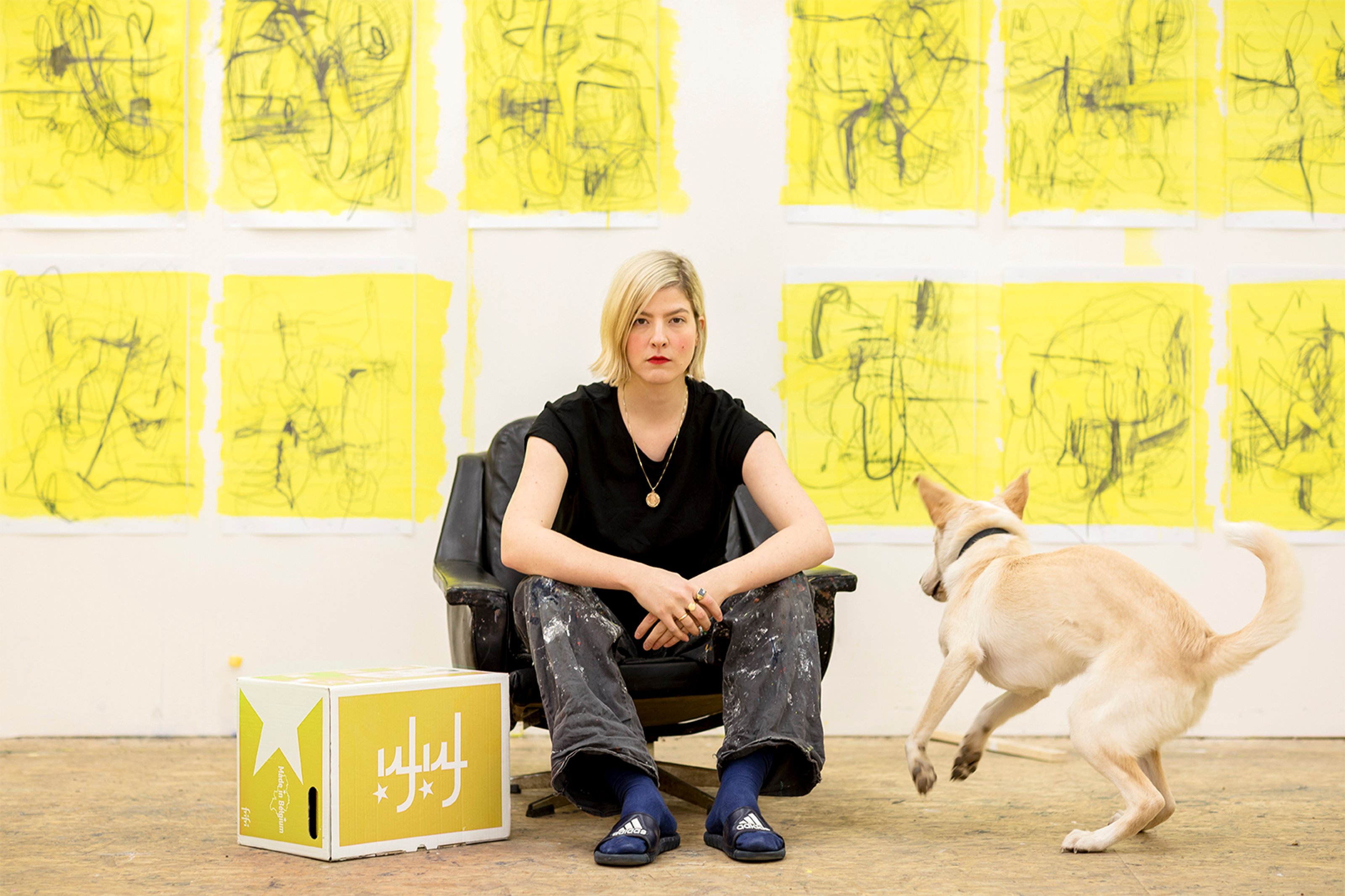
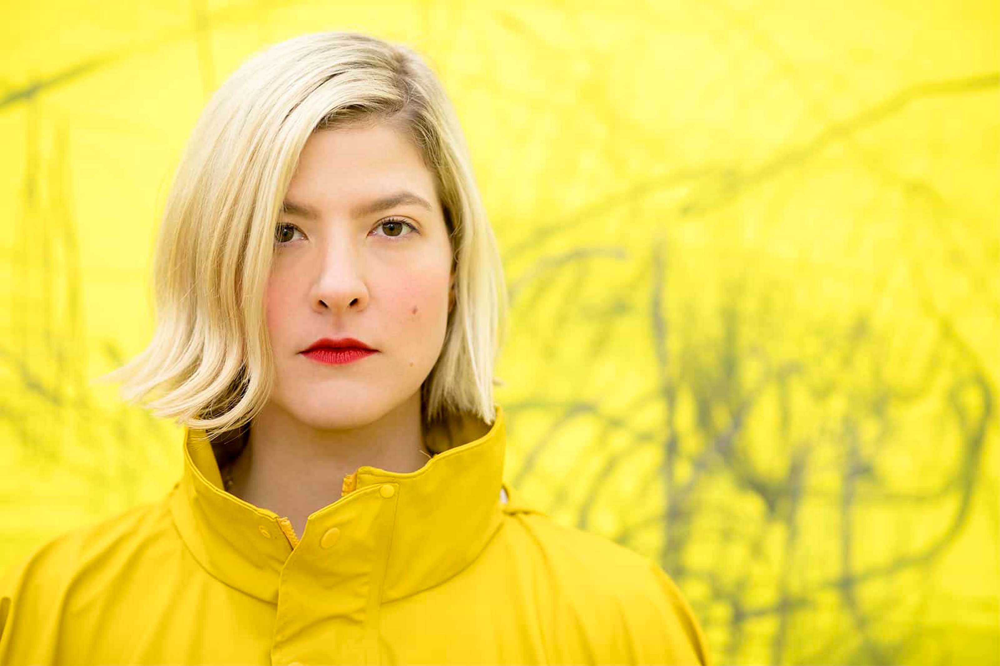
When Jana Schröder stands in front of a bare canvas and begins her gestural scribbles with copying pencils and oil paint, the formal rules of the act of painting are abandoned, yet not entirely forgotten. Monochromatic rivers of lines and curls leisurely percolate through, turning the aesthetic effects into an interactive space between artist and material. And, eventually, between artist and viewer. Unlike other traditional forms of painting where it often becomes about returning and staying within particular places of memory (our own, or those of others), the handwritten landscapes of Schröder emanate proximities of the present without wishing to retire elsewhere. Stark contrasts of overlapping colors — like yellow and shades of blue — cause an immediate recognition for whatever current reality. Our temporary alienation transforms into something warm and familiar, it’s nice to have arrived somewhere that doesn’t instantaneously encourage us to leave.
A former master student of Professor Albert Oehlen at Kunstakademie Düsseldorf, Schröder’s artistic choices are about process, they don’t ask to be intellectually-exaggerated into meaning just for the sake of being meaningful. The further analyzed, the more her work turns into a consciously-systematic reduction of interpretation where potential philosophical musings are eventually left to die. Somehow, though, this notion of absence doesn’t conjure the concern of purposelessness. A new consciousness rises — empty and grand — it’s about seeing what is, not what might be.
Collecteurs: You once said, “Art is contemporary, if it asks the right questions.” What are some of the questions we should be asking ourselves today? Do you think these questions necessarily need answers or, for now, is it just important that they’re being asked?
Jana Schröder: Throughout the process of Spontacts, I basically wanted to find out what scribbling is capable of. What happens with lines, what occurs in between two layers? What can be left behind? How can I accelerate, and how can I decelerate? When does the result come in, and what changes the outer circumstances? What does reproduction stand for? Is it good to lose control?
I’m finished with a series once I ‘give my okay’ and it leaves the studio. There are elements, of course, that influence the work after it leaves my side. From that moment on, it’s a bit like having a Tamagotchi — it’s up to the owner how, and if, they want to take care of it.

© Nicole Schäfer for Collecteurs
Collecteurs: The casual gestures on your canvases appear like automatic writing, a certain lack of control that directly asks the audience to see whatever they want to see. A little dangerous, since people are subconsciously more comfortable being told what to see and what to think. Is it your intention for your audience to get lost in their very own thoughts?
JS: I hope the viewer asks him or herself the same questions that I ask myself.
Collecteurs: If the audience doesn’t ask the same questions, does it mean the work has failed? Or does it mean it has taken on a different meaning?
JS: I think someone who comes from a similar background to mine, is likely to think the same. If something goes totally wrong, then I guess it’s the viewer’s fault, not mine.
Collecteurs: The works are also done with copying pencil, which means they change in nature once they come into contact with UV light. Do you like the idea of your works altering over time, depending also on the shifts of mood that occur from one day to the next?
JS:
Either the works are taken care of or age over time, turning into something different. Both outcomes are fine by me.
©Nicole Schäfer for Collecteurs
Collecteurs: Your paintings seem to reveal an absence of control. Yet, there’s order too. I wonder if it’s possible to intentionally devise a lack of control, since obviously the intent itself poses a paradox. Is it important for you to lose control when submerged within the process of creating? What does it actually mean to lose control?
JS: I need to have control when working, to a certain extent at least. It’s pretty quick to make curls with a copying pencil, but the painting itself needs to wait until I’m ready for the next step. The oil paint, for example, takes time to apply and, as that’s a conscious decision in itself, the loss of control has clear limits.
Collecteurs: I guess that’s the general order of life… control within chaos.
JS: Yes – exactly!
Collecteurs: The series Spontacts has been an ongoing project for several years now. It first began in 2011 or 2012; Canvases were covered in a million layers of blue that essentially seemed black to the viewer. Later on, you transitioned into lighter shades of blue and avoided the repetition of layers of paint. Why did you decide to continue working on this particular series, and not move on to a completely new series of works?
JS:

© Nicole Schäfer for Collecteurs
I began a new series last year called Kadlites. They’re not blue anymore, they’re yellow. More things are happening on the canvas, elements are erased and added again. It’s been great fun!
Collecteurs: There’s an interesting link between Spontacts and Kinkrustations, especially now that I’m aware of their simultaneous origin. Being so different in their physical impact — Spontacts feels rather soft in comparison to the black immediacy of _Kinkrustations_— they seem to have functioned as two separate outlets during their process. What made both of these works so similar, yet also so distinct?
JS: The matter of speed is an important factor here. Kinkrustations require many different layers of color. They have to dry – or at least begin to dry. It’s then followed by more color and oil. They’re dirty bastards, really. Spontacts, on the other hand, are done much quicker and half as messy. If the copying pencil touches anything though, even if just slightly, everything ends up blue. Spontacts are easier to grasp for people, whereas Kinkrustations are really something for an expert. Both will change over time.
Collecteurs: The color blue previously took an elemental part in your work, however there’s now a shift into yellow with the new series Kadlites. The singularity of color, however, remains.
JS: My works used to be very colorful before Spontacts. At some point I wanted to see if that same colorful chaos could also originate with one singular color. Since I also reduced other things, like the surface, the attention towards the line became much more significant. Blue is such an absurdly beautiful color, it’s almost impossible to think otherwise.
Spontacts also has a series with magenta, which works great. Once I also bought green copying pencils, but they were too ‘stiff.’ Blue and magenta are really the only colors that work. Kinkrustation is mostly ‘Prussian blue,’ which is also a difficult color since just a tiny spot can make it seem like it’s everywhere. If you add layer upon layer though, it looks good.
After all this mess I really wanted a neat studio. Due to the fact that during the Kadlites series surfaces were reduced, a yellow glaze worked best. It leaves enough pencil traces, yet it’s still able to visually consume the white surface.

Collecteurs: By documenting such ‘unreadable notes,’ there’s also a suggestion for thoughts to be deciphered. A divergence between the external versus the internal. Is it about a personal desire — a preposition — for humans to focus more on the internal instead of the external?
JS: For me, handwriting is purely about the aesthetic value.
Collecteurs: Alluding to words that are there, yet not entirely, I think your work also becomes subject to frustration, even if it goes nowhere.
JS:
© Nicole Schäfer for Collecteurs
Collecteurs: Why then choose to scribble and not write clearly? What do you want to provoke by scribbling?
JS: Either you choose a legible phrase — which will always convey a message — or you strip a word’s meaning. Both things work equally well, but I’m generally just interested in the aesthetics of handwriting. I want the viewer to feel ecstatic, in some way. The handwriting was also much more present in the first works and gradually evolved into scribbling.
Collecteurs: What originally prompted the inclusion of handwriting?
JS: It was the most direct way to start a picture and many letters are just very beautiful. For instance, ‘f,’ which directly from its under-curl flows into another ‘f.’ Repeating that 12 times creates a very elegant curl. The same goes for ‘h.’ Starting with ‘Z,’ ‘x,’ or ‘X’ is for professionals. A mirrored ‘F’ is also nice, but both strokes departing from the longitudinal line must be a little crooked. ‘C’ is a classic. It’s impossible to mess it up, regardless of how it’s positioned. An exaggerated ‘e’ also works. ‘B’ should just be left alone!
Collecteurs: What’s wrong with a capitalized ‘B?’
JS: It always looks funny. For example, it would just get in the way and put the viewer down after having laughed about it.
Collecteurs: Is handwriting ever about returning to the past?
JS:
© Nicole Schäfer for Collecteurs
Collecteurs: Do you ever see yourself moving away from works like Spontacts, explore drawing beyond the scribble, maybe even explore a medium that’s totally different?
JS: My new series Kadlites moves towards the idea of surface, leisurely getting rid of handwriting. I can’t promise though an ‘h’ isn’t going to appear somewhere!
A new medium though? I think I’m too much of a classic painter. My attempts at sculpture were always way too influenced by the 80’s. I think I could have been a great actress.